*This post MAY contain affiliate links. That means that if you make a purchase after clicking on a link I may earn a small commission at no extra cost to you. I don’t ever recommend something that I don’t use myself. Not all links are affiliate links. For more information, see our Privacy Policy.
Color in Quilts
Choosing the Fabrics That Will Make Your Quilts Sing!
Have you ever agonized over choosing the exactly right fabrics for your quilt? Choosing the correct fabrics for a quilt can make an otherwise ordinary pattern sing but there is no need to stress over it! Assuming you have been getting dressed all by yourself for a few years, you probably already know the basics of an effective design.
Interior decorators will tell you to pick an item you love and design a room around that. When you choose the clothes you will wear that day, don’t you do that? Based on your activities for the day, you decide you want to wear your favorite slacks and then pick the blouse, shoes, and jewelry to complement them. Depending on which blouse or what jewelry you wear that day can change the effect of your outfit from very dressy to downright casual.
It is the same thing for choosing the fabric in a quilt. Based on the eventual use of the quilt, decide on your main or focus fabric and choose the fabrics that will complement it. Don’t stress over every piece of fabric. It is the overall effect that matters. Don’t judge fabrics for your quilt up close – put them together and then stand back at least six feet to get the overall effect. If you are planning a wall hanging, put the fabric on the wall in a light similar to where you plan to hang it. If you are planning a quilt for a bed, lay the fabric on the floor and darken the room a bit.
Using different scales and values
When choosing fabric for a quilt, use the interior designer trick of incorporating both different scales and different values. Try to use a variety of scales in your quilt – large, medium, and small, as well as a variety of values – light, medium, and dark. Even perfectly smooth fabrics can be described as having a texture depending on the print. Try including a variety of textures, such as a smooth tone-on-tone or a choppy alligator print. Don’t try to be too matchy-uppy with your prints. It’s often the unexpected that makes a quilt into a treat.
It’s Value that does all the work in a quilt, although it’s often color that gets the credit. Usually described in terms of light and dark, value determines how close a color is to either white or black. The right values can make the difference between a quilt that sparkles and a quilt that doesn’t. A good scrap design, for example, depends on clear value contrasts between the fabrics.
Having trouble with the difference between values and color? Think of it this way: If the world contained only black and white, every color would still have its place on the grayscale and that place would be its value. If you aren’t sure, photocopy your fabric in black and white. By removing the color, you can more easily determine the value of a fabric. You could also use a value finder, a small device that looks like a slide with a piece of red or green cellophane in the middle (you actually need both.) Holding a value finder to your eyes and looking through it will help you determine the value of a fabric. (Hint: Student plastic report covers in green and red can be used as Ruby and Jade Beholders)
Here are some commonly used terms relating to color:
- Hue: Another name for color. These are the three types of pure or primary colors: red, yellow, and blue.
- Intensity: the brightness or dullness of a color in situ
- Tint: color + white, resulting in a lighter value. (pastels). Think spring.
- Tone: color + grey, resulting in a muddier, low-intensity value. Think predawn or dusk.
- Shade: color + black, delivering the darkest versions of color
The Colorwheel Can Help
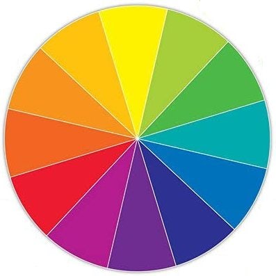
The color wheel has three Primary Colors – red, blue, and yellow. These are sometimes called the pure colors because every other color is made up of some combination of these three. They will be found on the outer ring of the Color wheel. On the second ring are shades which are the color plus black. The third ring is for tones, which are the color plus gray. The inner ring is for tints, the color plus white.
The Secondary Colors are the colors that make orange, green, or violet when mixed.
Intermediate Colors (sometimes called Tertiary or Triad colors) are a combination of one primary color and one secondary color. These are: blue-violet; red-violet; red-orange; yellow-orange; yellow-green; and blue-green. These 12 colors are occasionally referred to as high-intensity colors.
The warm half of the color wheel–from red-violet to yellow –is considered warm. These colors are often the dominant colors in a quilt, appearing as if they are advancing toward you. The other half–from yellow-green to violet–is considered cool. These colors appear to recede, as though the space is expanding. Pure colors will also tend to advance, while tints tend to recede.
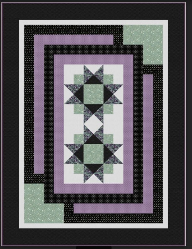
Keep these effects in mind if you are designing a quilt you want to appear three-dimensional. Don’t forget that the warmness or coolness of a print often depends on its relationship to other prints. A warm color in the middle of several cool colors will look warmer than the same color in the middle of several other warm colors.
The purity of the color compared to its neighbors can also change the effect of that color. For example, a pure color such as yellow, in the middle of more muted colors (tones and shades) will draw the eye to that color. This is one way to create the illusion of transparency. For example, a yellow surrounded by red with orange in between them gives the illusion of yellow washing over red.
Using the Color Wheel
Color Wheels are tools that teach color relationships by organizing colors in a circle so you can visualize how they relate to each other. Most color wheels will have a second wheel on the top with a window in it. This second wheel spins around the color wheel and can help you choose color combinations.
Complementary Colors are colors that are opposite each other on the wheel. Blue and orange for example or purple and yellow are complementary colors. Because you are using colors from both the warm and cool sides of the color wheel, pairing a color with its complementary color will make both colors more vibrant.
For a little more variety, use two colors and the complement of the color that is between them. For example, between purple and green is blue. The complement of blue is orange, so a purple/green/orange combination would work. This is called a split complementary. A split-complementary can also use one color plus the two colors on either side of its complement. Split-complement quilts have less contrast than straight complements. You could also try incorporating tints, tones, and shades of the various colors.
Analogous Colors are several colors that are next to or very near each other on the color wheel. Yellow and orange for example, or yellow, green and blue. Colors that have an element common to each other will always look good together. For example yellow and orange (which is actually yellow mixed with red.) To spark an analogous quilt, use an accent color that is directly across the color wheel from the center analogous color. For example, yellow, orange, and blue-violet.
Monochromatic Colors are the various tints, tones, and shades of a color. A monochromatic quilt can be very soothing – or very dull and boring. A monochromatic quilt depends on a variety of contrasts in value, intensity, temperature, and texture to avoid being dull. This is a good place to use tints, tones, and colors.
Triad colors are three colors equally distributed on the color wheel, such, as red, yellow, and blue. Tetrad colors are the four colors equally spaced around the color wheel combine to make a tetrad. Because these combinations use colors from both the warm and cool sides of the color wheel, quilts made in these colorways tend to be more vibrant.
Polychromatic colors are the exact opposite of monochromatic colors. Polychromatic quilts are an explosion of color – think scrappy or controlled scrappy quilts.
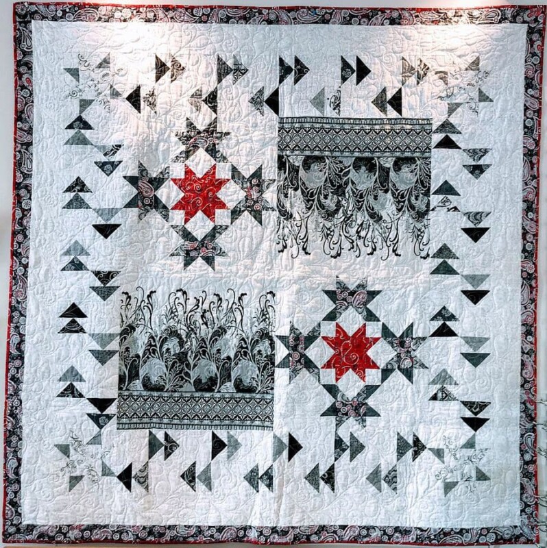
Neutrals–black, white, gray, and every variation in between–are not part of the color wheel. When using these colors in your quilt, black is considered to be warm while white and gray are considered cool. Use a light neutral with a white base if your quilt has a lot of tints. Use an off-white or beige neutral with a gray base if your quilt has a lot of tones. It’s good to use some neutrals in your quilt to give your eyes a place to rest.
Still struggling?
Get out your crayons or colored pencils! Print a few pages of graph paper from a free site, and color in the little boxes. Don’t be afraid to blend colors to get just the right effect. Do a little experiment – what does red look like when it is surrounded by yellow? How about blue? Can you create a shadow or an accent using tones and tints? It is much easier to play with crayons than fabric. If you don’t like something, toss it and start again.
Or, better yet, set it aside and look at it tomorrow. Sometimes your brain will work on a problem even while you are thinking about something else. The next day, you look at the colors again and get a flash of inspiration!
Other places to find inspiration might be other textiles, children’s toys, pictures of nature, Pinterest. Everything you look at has a color scheme: bright and beautiful, muted and mysterious, organized or chaotic. Do you have a scrap stash? Cut 2″ squares from various pieces of fabric and rearrange them, putting them in order from dark to light the first time, from large scale to small scale the second time, following the colorwheel the third time. You aren’t trying to make something, you are just sparking your imagination.
Common Color Associations
When choosing a color scheme, consider common color associations. There is always a strong symbolism inherent in color. For example, some cultures associate violet with royalty. Use the brightest color in your palette to call attention to the most important elements but remember that large areas of bright, strong colors can be overpowering. Small areas of light colors can be overlooked altogether.
Warm Colors
Red: Red has exciting and possibly dangerous associations such as love, passion, energy, speed, strength, heat, aggression, danger, fire, blood, violence, and aggression. Red is an excellent attention grabber and accent but could easily overpower the viewer if used as a background color. Red means stop or signals warning or forbidden actions in many cultures.
Orange: Demanding attention, orange suggests energy, warmth, enthusiasm, flamboyant, demanding of attention.
Yellow: Yellow has generally happy associations such as optimism, imagination, sunshine, summer and gold. But it can also convey dishonesty, cowardice, betrayal, deceit, illness, hazards. Yellow demands attention, but use it in small and/or muted quantities to avoid eye fatigue and aggravation in your viewer.
Cool Colors
Green: The color of life on earth is generally regarded as hopeful, natural, healthy, lucky, vigorous, generous, and fertile. It can also signify jealousy, inexperience, envy, and misfortune. In North American cultures, green means go, is associated with environmental awareness, and is often linked to fiscal matters.
Blue: The color of peace, blue brings to mind soothing associations such as peace, stability, harmony, trust, truth, confidence, conservatism, loyalty, security. It is also associated with coldness, sadness, technology, and depression.
Still, it is often cited as the world’s most popular color, perhaps because of its association with water.
Violet: Once a difficult and expensive dye color, violet has become associated with royalty, spirituality, ceremony, wisdom, enlightenment, and creativity. Violet is associated with death in some cultures.
Tones, Tints, and Shades
Gray Tone: Cool, muted colors in the gray family convey security, stability, intelligence, maturity, conservative practicality.
Brown: Considered an earth color, brown is brings to mind home and hearth, the outdoors, stability, simplicity, and comfort.
White Tint: White is associated with purity, truth, simplicity, cleanliness, peace, winter, cold, clinical, snow, sterility, marriage (Western cultures) and death (Eastern cultures),
Black Shade: Mysterious black often conveys sophistication, formality, power, elegance, wealth, fear, sadness, remorse, anger, mourning, and death in Western cultures.
Not sure what to call a color? Try this Name That Color wheel.
Have another tip to offer? Send it to me or reply below and I will add it here.
Don’t forget to sign up for the newsletter! Once a week, I send updates on quilt-related information I have found while wandering the web. This might be an inspiring article, a tip or tutorial I have discovered (or written), and occasionally exclusive offers & discounts as well as immediate access to the secret page of free patterns, guides, and printables. You can follow my page on Facebook, or join the Make Believe Quilters group, too.
Great post. I don’t seem to have much of an issue with colour in a quilt. I am told I have good instincts. But, this post was really interesting and I have saved it.
Thank you.